
Table of Contents
Trends shift. Beige is back. Gray is out. Then gray is back. Accent walls come and go. But one color manages to cut through all of it and stay solid: navy.
Not baby blue. Not royal. Navy.
Discover the one color that works in every room (and how to use it!) for timeless style, versatility, and effortless home design.
Why Navy? It’s Strong, Clean, and Surprisingly Flexible
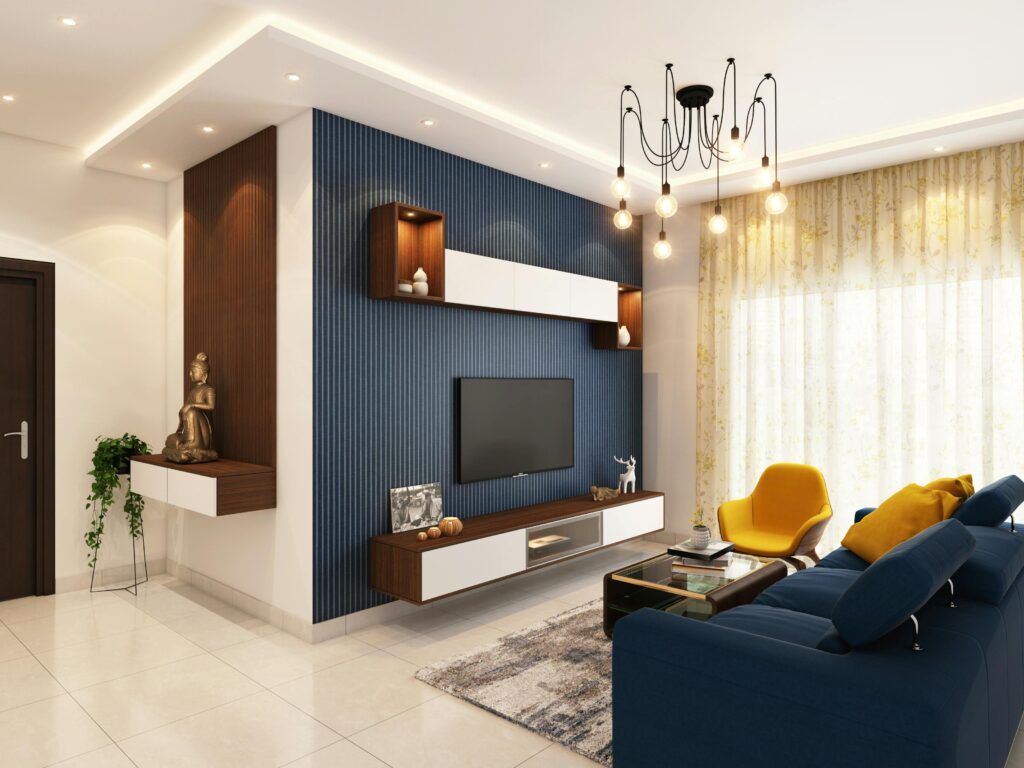
Navy works in any room because it plays both sides — bold but neutral, calming but dramatic. It doesn’t scream for attention, but it doesn’t disappear either. It can anchor a space or fade into the background, depending on what you pair it with.
It’s a color that feels confident, not trendy. And unlike black, it doesn’t suck the life or light out of a room.
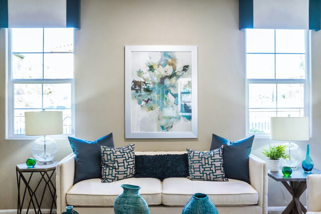
In the Living Room, It Grounds the Chaos
Family rooms take a beating. Toys, foot traffic, spills, snack debris — you name it. Navy helps balance that visual noise.
A navy wall or even just a navy rug creates a focal point that anchors everything around it. The room feels more pulled together, even if there are Goldfish crackers under the couch.
If you’re not ready to commit to paint, try navy throw pillows or a slipcover. It’s deep enough to hide stains and neutral enough to work with almost any color scheme.
Use Navy in the Bedroom for Calm Without Boredom
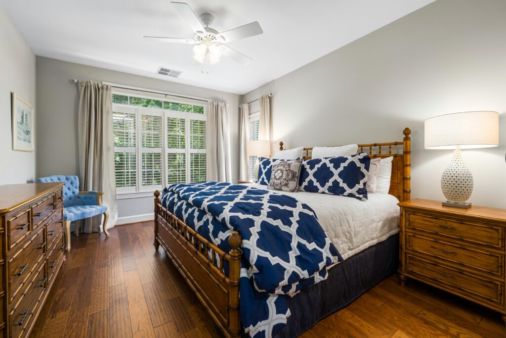
A lot of people go for soft pastels or all-white bedrooms to feel relaxed. The problem is that it can end up feeling flat or washed out. Navy gives you calm with contrast.
A navy accent wall behind the bed makes everything else in the room feel sharper — wood tones, whites, even metallics. If you want to skip the paint, go for a navy headboard or bedding. It’s easy to mix with ivory, tan, blush, or muted green for a clean, balanced look.
And unlike lighter colors, navy feels cozy at night, perfect for winding down.
In Bathrooms, It Adds Instant Polish
Bathrooms typically don’t have a lot of space to work with. But even a little navy goes a long way. It instantly gives a small room depth and sharpness, especially when paired with white tile or warm brass hardware.
Try it in:
- Vanity cabinets
- Towels and rugs
- A single painted wall or ceiling
- Shower curtains with subtle navy patterns
It elevates the space fast with no full remodel required.
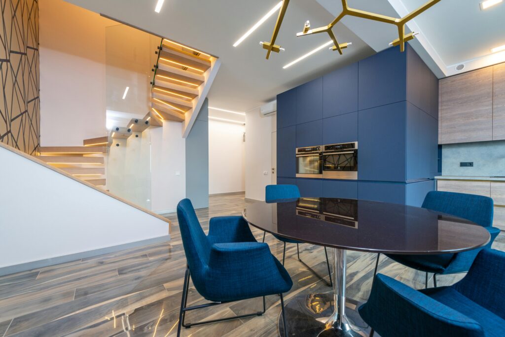
Kitchens Are Where Navy Shows Off
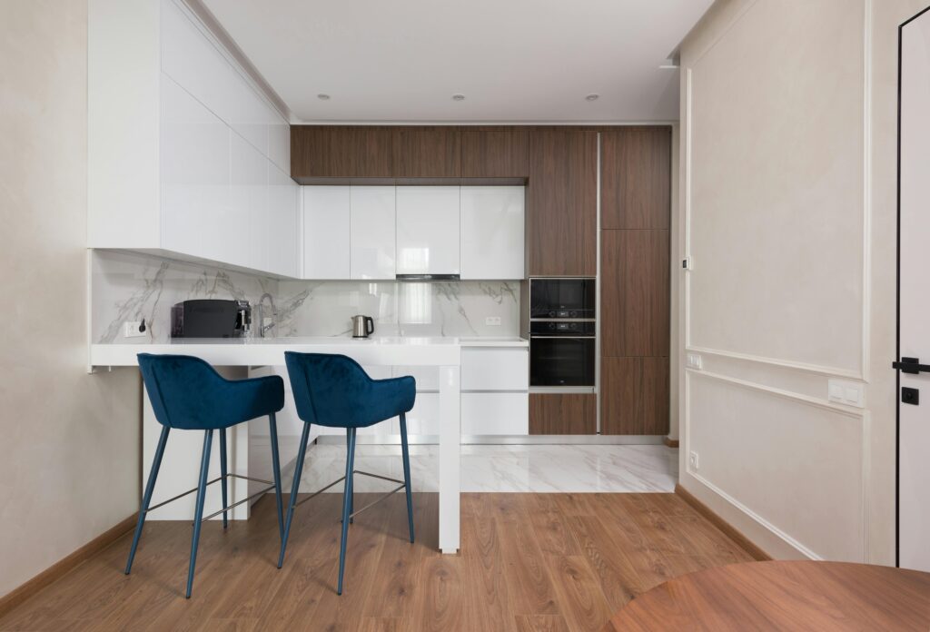
White kitchens are everywhere. They’re clean, yes, but they can start to feel clinical. Navy softens that while still keeping the space bright and sharp.
Lower cabinets in navy with white uppers? Timeless.
A navy island in an otherwise neutral kitchen? It feels custom without being loud.
Even navy barstools or small appliances add a sense of design without taking over.
And if you’re dealing with messy eaters, navy does a better job than white or beige when it comes to hiding splashes and smudges.
Navy in Kids’ Rooms Is a Lifesaver
Forget the idea that kids’ rooms need to be pastel or covered in patterns. Navy gives structure without feeling strict. It works for toddlers, tweens, and teens — you won’t have to repaint every few years.
You can use it in:
- Bedding or rugs that hold up over time
- One statement wall to tone down bright toys or posters
- Storage bins or shelving for a more organized look
It grows with them, and it hides everything from fingerprints to marker streaks.
Pairing Navy: What Works (and What Doesn’t)
Navy’s biggest strength is that it plays well with others. But some pairings work better than others, depending on the room’s mood and lighting.
Use these pairings to guide your combos:
- White or ivory — classic and crisp, good for any room
- Warm woods — adds softness and texture
- Blush or dusty pink — makes navy feel fresh without being too sweet
- Brass or gold accents — warms it up instantly
- Muted greens or olive — earthy and calm
- Gray or charcoal — modern and sleek, but can feel cold if overdone
What to avoid: pairing navy with super bright primary colors. It can veer into preppy or nautical if not balanced right. Stick with tones that feel lived-in, not loud.
Lighting Matters More Than You Think
Navy shifts a lot depending on the light. In rooms with lots of natural light, it can look vibrant and bold. In darker spaces, it leans more moody and dramatic.
Before painting an entire wall or buying a navy sofa, test a swatch or fabric sample in your space. Look at it in morning light, afternoon, and evening. Some navy tones have more green or purple in them than you’d expect — lighting brings that out.
And if you’re working with a windowless space, balance navy with lighter tones and plenty of warm lighting. It can still work — you just have to layer it right.
Start Small if You’re Not Sure
If painting a wall navy feels like too much, start with one element. A navy throw on the couch. A table runner. A lamp base. A set of pillowcases.
Use navy as a test color in smaller doses, then scale up once you know how it plays with your space. It’s one of the few colors that won’t go out of style next season, so it’s worth the investment.
It’s the Quiet Power Color Your Home Needs
Navy doesn’t scream. It doesn’t beg for attention. But it shows up, does the job, and makes everything around it look sharper and more intentional.
It’s the one color that works whether you’re designing a playroom or a home office, a master bedroom, or a hallway. Clean, strong, flexible, and underestimated.

Hi, I’m Christian, a 43-year-old father of two and a lifelong DIY enthusiast. My workshop is where I spend countless hours experimenting, upgrading, and fine-tuning. Sharing my experiences and practical advice is my way of helping others create homes they love.